"Seoul Rising" is a poster design concept crafted in honor of the illuminating Seoul Lantern Festival, a spectacular two-week event hosted in South Korea every November. Rooted in the shared human desire for hope and unity, especially in the face of the uncertainties brought by the pandemic, the concept is a representation of humanity's journey out of darkness. This message is conveyed through the metaphor of lanterns illuminating the path forward, transcending challenges and ushering in a brighter era. This central theme harmoniously aligns with the project's objectives, as it pays tribute to the Seoul Lantern Festival and serves as a beacon of inspiration and resilience for all who engage with the poster.
Duration 4 weeks
Role Visual Designer (solo project)
Tools Illustrator, Photoshop
Specifications 11 x 17, Event Promotion
INSPIRATION
The design draws from the festival's thematic evolution over the years. Notably, South Korea's distinctive graphic design legacy, characterized by its cultural reverence, minimalistic aesthetic, and daring experimentalism, plays a pivotal role in shaping the design's visual language. This melding of influences serves as a testament to the project's aspiration to encapsulate the festival's essence while infusing it with a contemporary and forward-looking spirit.
Your Seoul, Light Your Dream (2019), Twinkling Light of Hope (2020)
MOODBOARD
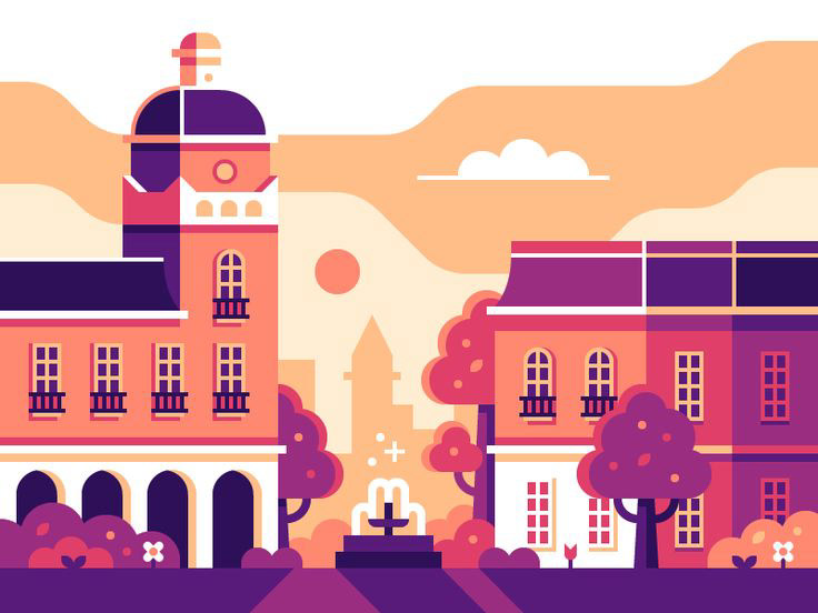
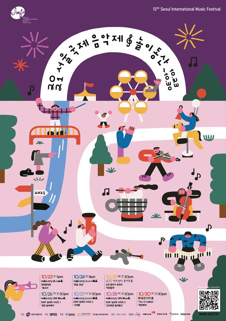
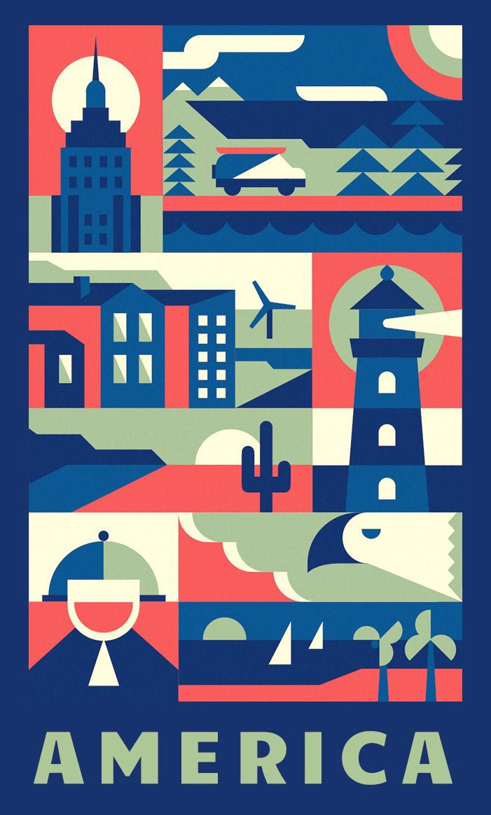
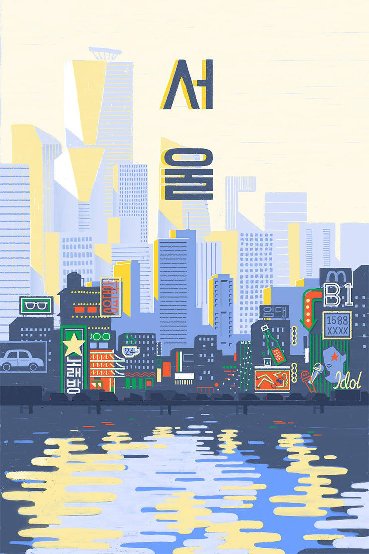
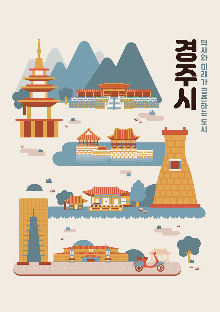
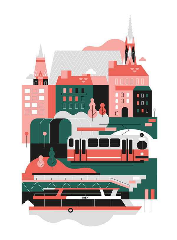
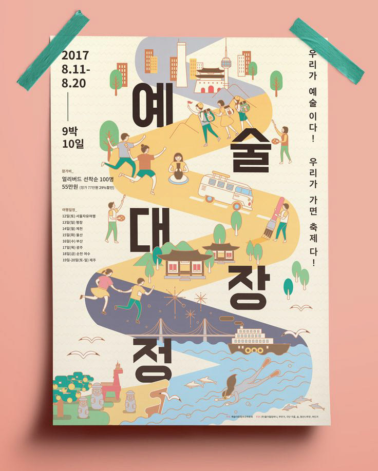
ITERATION & FEEDBACK
Moving forward with the illustration phase, I made sure that the design remained impactful even in black & white or grayscale. The idea was to ensure that color, when introduced, would enhance the overall message. When the design was under critique, a valuable suggestion emerged – to incorporate a traditional South Korean pattern. This addition would serve to emphasize the traditional elements in the foreground, creating a contrast with the modernity of the flat illustration.
In response to this feedback, I integrated the traditional pattern, enriching the visual narrative. However, as I stepped back to evaluate the design as a whole, it became apparent that the background was appearing a bit too dark, which could potentially impact the overall clarity of the message. To address this, I introduced more of the teal color, striking a balance that not only enhanced clarity but also contributed to a more visually harmonious composition. This iterative process of incorporating feedback and making thoughtful adjustments ultimately culminated in a design that effectively merged tradition and modernity while delivering the intended message with clarity and impact.
VISUAL IDENTITY
The visual identity incorporates a range of elements that truly encapsulate the essence of Seoul and its Lantern Festival. You'll notice a diverse mix of background elements including iconic aspects like the traditional attire, giving a nod to the cultural heritage that's deeply embedded in South Korea's identity. Then there are depictions of the very people the advertisement aims to reach – individuals, families, tourists, basically anyone of any age who's drawn to the festival's charm. I made sure to weave in some of Seoul's most renowned tourist attractions as well.
At the heart of the design, you'll find the Gyeongbokgung Palace. It's strategically placed at the bottom as a foundational pillar that represents South Korea's rich history. It's the starting point from which the whole design story begins to rise. And that's exactly what is captured with the light in the design. This rise symbolizes not only the lanterns illuminating the festival but also the rising spirit of Seoul itself. A vibrant and bold color palette is employed to make this visual narrative even more engaging and stir up emotions, grab your attention, and mirror the dynamic energy that's characteristic of modern South Korean culture. The colors create a captivating visual experience that mirrors the festival's own dynamic and lively atmosphere.
FINAL DESIGN
By embracing flat illustration, the design embodies the simplicity inherent in South Korean design, while deftly weaving in cultural motifs that resonate with Seoul's ongoing transformation. The result is a portrayal that seamlessly blends the city's heritage with its modern identity, effectively encapsulating its dynamic evolution. The vibrant and bold color palette, evokes emotion, captures attention, and reflects the dynamic energy of modern South Korean culture. This conscious infusion of tradition and innovation resonates deeply with the project's aims, as it not only pays homage to the festival's history but also underscores its relevance within the context of the ever-changing urban landscape.
KEY TAKEAWAY
The journey of creating Seoul Rising has highlighted the incredible value of feedback in achieving the project's objective and pointing the design in the right direction. The input received during critiques helped fine-tune the design, adding layers of depth and meaning that might have been missed. It's a reminder that collaboration and fresh perspectives can truly elevate a project. Feedback not only refined the visual narrative but also ensured that the message resonated clearly. This process showed that in the world of creativity, feedback isn't just helpful, it's essential. It's the secret ingredient that takes a good project and makes it outstanding, and in the case of Seoul Rising, it's been the driving force that brought a vision to life.
Design in Use
AWARDS
2022 ADDY Student Competition - Gold

